Showing posts with label glitter. Show all posts

Sunday, October 22, 2017

Monster Blood 3.0

Ok, I've officially got a Problem. I just can't resist drip art in October. Halloween has the best nail art color combinations: rich blue purples, the full range of pumpkin oranges, shimmery blacks, sparkly golds, sassy greens, warm crimson...how do you choose? Drip manis let you play with lots of colors really easily, and something about them just says Halloween to me.

So I did two more this year to add to my collection of Halloweenie drips from last year and the year before. This year I started with a skittlet-I guess I got excited.


You'll recognize the green and red combo from my first Monster Blood design. It's Sinful Colors Happy Ending with NYC Crystal Couture in Ruby Queen. Happy Ending has a great gold shimmer, and I completely objectively think you need it in your collection. This time I added a new shade to the party: Broadway Nails Gel Strong in Black. This color will not satisfy the craving if you're looking for a solid black creme, but is still very much worth picking up. It's got a red shimmer that makes it special, and the application is very good in two coats.


Once I saw the full mani, I decided I liked the red and black best. Next thing I knew, it had transmogrified onto all of my nails. Spooky!


For the red, I started with one coat of Julep Catherine, a red-red jelly, to get Ruby Queen to "take" in fewer coats (you can get similar coverage in 3/4 coats of Ruby Queen alone). Then I doused it all in Out the Door topcoat for big time shine. While it's hard to see the red shimmer in Black in photos, you can spot it in the bottle shot pretty clearly.
I can't promise this will be my last drip of the season. What colors would you want to monster-mash up? What colors do you use for drip manis outside of the Halloween season?

Tuesday, May 16, 2017

Manis of the Week: Flakies Two Ways

Flakies keep coming in and out of style as a nail polish finish. My theory is that we hate wearing them because they lay bumpy and are notoriously poorly behaved, but then you see them and... "ooooh, pretty!" Iridescent sparkle bits are irresistible. I don't have a ton of flakies (see "lays bumpy, poorly behaved"), but I do have a favorite, a simple iridescent Avon topcoat that I found at a flea market. This week, I pulled it out twice, and got two completely different looks. Excuse my less than ideal photos this round- this topper proved to be tough to photograph, and I was ready to get this out to you!

First up, a look you might recognize: I did opal. Remember when I did that before? I don't blame you if you don't, it's been a long time. The process was similar though, I've just improved some of my fundamentals. For my base, I used Julep Janie, a milky white, instead of a stark white. I think going with something softer gave my recreation a more realistic look and let my highlight colors shine. Then I sponged a little Francine (green foil shimmer), Juliana (sheerish pink-orange shimmer), and Yiyi (soft purple holo jelly; all Julep), then topped with the flakie topper and one coat of Julep Desiree (gentle scattered holo topcoat). My other nails and the gold "frame" at the bottom are Sinful Colors Gold n' Roses.


For the second look, I went bright, layering the flakie topper and Desiree over Broadway Nails Matte Shine in Glamorous. Glamorous is a matte teal, and while it's not extraordinary, it's pretty enough, especially after you put some shine on it. But then I didn't stop. I added flakies, then holo glitter, then more flakies...pretty soon I had a super pretty, very poorly behaved mani with tons of depth. Even though the flakies on my opal mani are louder IRL, they're still much more subtle on the softer base than they are on the loud blue-green of Glamorous. This was not a subtle mani!


I've got to say, an iridescent flakie topper is worth the hunt. Sinful Colors Digital Dreams is one out now that's easy enough to find, but I passed on that one in favor of the more jagged look of the one I already have. I love this topper for more organic looks. Do you have a favorite flakie?
Bottle shot from my first opal mani post. I think the recreation is an improvement!

Sunday, January 10, 2016

Second Chance Mani Do Overs

Have you ever tried a polish and said "meh," dropping it in your stash as unimpressive, only to decide later that it very well may be your Favorite Polish of All Time? I know I have. I hate the idea of having great polish going unused, so I decided to dust off a few of those "meh" shades for polish Do Overs! The rules were that it couldn't be a polish I use regularly for manis or nail art, has to be a polish that I disliked because of the color itself, not formula or some other reason unrelated to the particular shade, and I wore them all for at least a full day. Here's what happened.


I started out with Julep Rochelle. When I first picked it up, I tried it on and thought it was...fine, I guess. It was purple. I have a love/hate relationship with purples-I have dozens, and some of my best loved shades are purple, but I tend to find purple polishes uninspiring in general. Then I kept picking up Sinful Shine Haute Shine and thinking "I already have Rochelle, it's nothing special, and this one looks just like it," so I decided I needed to crack out Rochelle again before buying a dupe. Turns out, I love Rochelle! It's a gorgeous, glowy shimmer that applied beautifully and looks rich and elegant. It's almost chromy, and the shine is fantastic. I have a coat of Sinful Shine topcoat over it here, but it shines on its own as well. This is two easy coats. I did have some tip wear pretty quickly, but this one is still officially back in the rotation.


My next Do Over was Sinful Shine Prosecco. I was so disappointed when I bought this one a few months ago. I had oohed and ahhed over it in a display but didn't buy, and when I went back for it, it wasn't there. It suddenly became a unicorn. I needed it. I obsessed over other bloggers' swatches. I scanned the displays in multiple stores looking for it, only to leave dejected. So when I finally found it on eBay for $7.99, I snatched it up.

You have to understand, I'd just paid eight dollars for a polish that retails less than $2, waited a week to get it, then put it on my nails and hated it. Not just didn't love it, straight up hated everything about it. Super thin formula. Terrible with my skin tone, even though on paper it should have looked great. Between the formula and the finish, couldn't even use it for nail art. Three strikes. I pushed it to the back of my Sinful Colors stash and growled a little every time I looked at it.

My relationship with this polish is now better, but still strained. This was 4 coats, and it took a very long time to dry. I still think it's completely wrong for me, but when I was wearing it, I had to appreciate that gold shimmer. I probably won't wear it alone again, but maybe there's some hope with layering?


The last polish granted a do-over this round was Essie A Cut Above, from their LuxEffects lineup. I've used this polish here and there for nail art, but it never really struck me as a headliner. A Cut Above is kind of basic: shimmery pink hex glitter in different sizes in a clear base. It's my only Essie polish, gifted to me by someone who didn't think it was her style. Since it is a topper (and I don't think it was ever intended to be a standalone), I paired it with Julep Linda, a cool pale grey. I love pink and grey together, especially in the winter for some reason, so I hoped it would bring out the best in it. For the most part, I was right. Linda and A Cut Above seem to play well together. Linda is warmer and more lavender toned when they're teamed up, which looked nice with my skin tone, and A Cut Above's sparkle was more sophisticated on a neutral base. I really like this mani.


That being said, I don't particularly like this polish any more than I did before. Because all of the glitter is the same shade, it falls a touch flat. What really tipped the odds against it was the application. Because I was going for gradiation, I had to do quite a bit of manipulating to get the glitter where I wanted it. I like the finished effect, but it wasn't very cooperative when I was trying to get it. All in all, the re-try didn't improve my opinion of this polish. It's just not exciting enough to be worth the price tag.

Even though two of my three do-overs still struck out, I enjoy retrying polishes I wasn't initially in love with every now and then. My tastes change sometimes, or I notice a new way that this polish could fit into my style. And you never know when a polish will be exactly right for the look you're going for, so pulling out colors I don't wear often reminds me what I have available. What's a polish that didn't win you over right away, but now you love it?

Thursday, December 17, 2015

Recreation: PGS Glitter Ruffian

I was a huge fan of now-defunct blog Pretty Girl Science, and I'd saved one of Nichole's posts on my Bloglovin' Nail Ideas folder, where all the really cool nail art posts go to languish, waiting fruitlessly for me to recreate them. (Never fear, PGS's Nichole still posts at Bedlam Beauty, while Amanda can be found at Some Weird Sin.) This time, though, I actually did one!


I had held off on recreating Nichole's black and glitter ruffian (original here) because the glitter she had used was so unique. She packed Octopus Party Nail Lacquer's Glow for the Gold and The Royal Tannenbaums for a multicolored glitter extravaganza. I didn't have anything similar, and it was the color combination that had won me over, so it sat. I had almost written it off as one of those manis that was built around a random indie polish I'd likely never own.

Then the wheels started turning again when I bought Sinful Colors Pride, a multicolored, multisized round and hex glitter topper that layers to full coverage relatively easily. To get the color effect I wanted, I started with my black base, then used a short striping brush to polish on a thin layer of NYC Fashion Queen into my ruffian shape to give the extra pop of gold that glammed up Nichole's mani. The pre-shaped design made layering in Pride super easy. It took about 2 coats with a little spot dabbing to get the glitter saturation I wanted, but boy was it sparkly!


I think that Pride is a little chunkier than the OPNL glitters Nichole used, but the overall look that prompted me to hit Save on that post is definitely there. I love how this mani turned out-a really classy take on a very, very high sparkle look that was, as she promised, quite easy to achieve. I was especially excited to have recreated it with easy to find, inexpensive shades. Both Pride and Fashion Queen are drugstore polishes (and you could actually use any gold glitter as your ruffian base for a similar effect), and my base is a basic black- Julep Cleopatra this time. I topped it with Sinful Shine Top Coat.

As a PGS devotee, I was sad to see it end, but two blogs are better than one, right? I was glad to finally recreate this throwback to their starter blog. What other glitter combos could be fun for this look? Have you ever recreated an indie look with mainstream polishes?


Friday, March 27, 2015

New to Me: Sinful Colors Cream Pink

Hanging out at Big Lots, one of my favorite places to troll for previously unspotted colors, I found Sinful Colors Cream Pink. A quick web search suggests it was originally released around 2011 or 2012, but I hasn't seen it in displays...until I bought it. Then I noticed that it had reemerged in the About Blooming Time collection, as identified by Nouveau Cheap. I was drawn to the gold shimmer, and the minute I put this color on, I knew I needed to photograph it. It. Is. Fabulous.


At first the name threw me off-why it's called Cream Pink when it's clearly a shimmer is beyond me. I was worried that all of that glorious in-bottle shimmer would melt away on the nail. Not a problem. The shimmer is very present, and mesmerizing. It's an instant favorite. On the down side, the formula is a little weird. It's not quite opaque, with VNL at two coats, but it's still a fairly thick consistency, so I had to be careful with the third coat an while it dried to avoid polish wrinkles. It dries to a kind of satin finish. Here I topped with Julep Freedom topcoat. Once you shine it up, Cream Pink is a delightfully squishy shimmery hot pink. Pink lovers must have this.

Not one to leave well enough alone, I added a sparkly gradient of Julep Joelle and China Glaze Fairy Dust. It's so pretty!


Are you a fan of pinks? Has Cream Pink made it into your collection?

Saturday, February 28, 2015

$5 Mani: Jelly Sandwich

I love indie polish...because who doesn't anymore? It's the best. But there's still a special place in my heart for drugstore polish. The sad reality is that I can't afford to buy all the indies and high end stuff. Luckily for us, there are some really good polishes readily available in most areas for decent prices. For those of us who can't go on an indie shopping spree every time we decide to get a new polish (insert brief fantasy of being able to waltz into K-Mart and pick up baskets full of A England and ILNP), I bring you $5 Mani! In these posts (hopefully there will be lots of them), I will feature full nail art looks with two or more polishes that I purchased for $5 or less, and most will be easy to find at mass retailers.

For my first $5 mani, I went back to the jelly sandwich, a trend that I never got to when it was cool-typical. Jelly sandwiching is when you take a jelly polish and layer it both over and under a glitter. I hadn't tried it because I have a preference for opaque looks, but the sheer squishiness of jellies is winning me over. I brought out NYC Color NY Princess as my base and layered with Sinful Colors Love Sprinkles, an LE matte white heart and hex glitter. NY Princess has its own glitters, which made it fun for this look. Oddly, I mentioned back in August when I reviewed the NYC Fashion Queen collection that I may try it in a jelly sandwich sometime, so it's fitting that I used it for my first one. Incidentally, NY Princess was much more cooperative this time around. The base on Love Sprinkles is a little thick, it had to be sweet talked into participating in this look. Both polishes retail at $1.99, so even without any discounts or sales, the total cost of this look is $3.98.

Jelly sandwich technique will take some practice, but I like this mani. The different types of layers make a monochromatic look that's really interesting-and it's so squishy! I have tons of glitters that may be fun in this technique next time I need something that both squishes and sparkles. Do you still wear the occasional jelly sandwich, or are you on to the next look?

Monday, February 23, 2015

Black Dahlia Lacquer Blue Half Moons

Nothing super fancy to show today, but I know it's been kind of quiet here recently, so I wanted to drop in and show you a quick nail art look featuring polish from Black Dahlia Lacquer, which is quickly becoming one of my favorite indie brands. The formula is always good, and they have a few distinct finishes characteristic of their polish that I really love, so once you've tried them, you have a pretty good idea of what you're going to get next time. Plus they come in two sizes-great for a blogger on a budget.

The base color of this mani is Texas Ice Flower, from their Holiday Collection. The glitter half moons are Twilight Orchid, which I got as a free mystery polish during their Black Friday sale. It's not currently available on the site.


Here's a closer look at those finishes I was telling you about. Texas Ice Flower has a gorgeous subtle scattered holo glitter that makes it look more "blue, but better" than a true holo polish. This is two coats with Sally Hansen 3D Gel Shine topcoat, with the half moons applied with a dotting tool, no topcoat. For a chunky glitter, Twilight Orchid dried really quickly.


Sorry for the radio silence lately. This has been a bit of an awful month for me personally, which diverted me from some of the nail art challenges, reviews, and other fun things I had planned to do. It's also taken a toll on my nail care routine, so I also don't feel like they've looked very blog ready lately. While I can't say that things are back to normal quite yet on either front, I appreciate that people are still checking out the blog and interacting on social media-it's such a mood booster. Thank you!

Wednesday, February 11, 2015

Does It Work? Tea Bag Wraps

If you follow me on the Twitter, you may be aware that I had a pretty nasty break recently, right on the middle finger of my swatch hand! It wasn't a full break, though; my nail split diagonally to almost the center of the nail, so it would be both painful and cosmetically unpleasant to cut it down, so I'm trying to avoid that. I remembered that I had once tried tea bag wraps with mixed results, so I went to a tutorial on xoVain to give it another shot. While I by no means think I can do it better than the tutorial, I took some pictures tonight to show you how it worked for me.

Oh no!

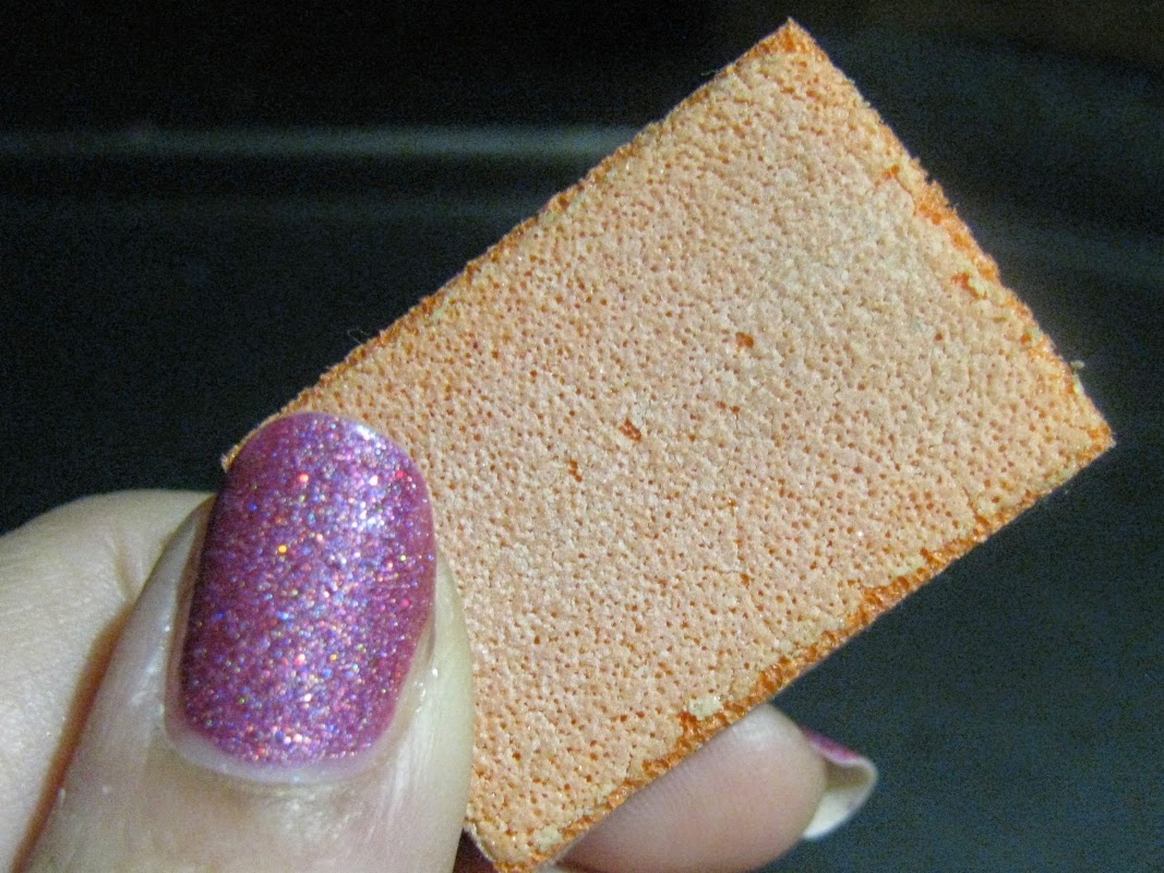
I started off with a gentle buff to smooth everything down. I used an old, worn down mini buffing block-it looks pretty ugly, but it's great for this because you have to absolutely baby the break to keep it from ripping off, plus you want to do as little damage to the nail plate as possible while the nail is growing out.


Then I chopped up my tea bag. You want a piece longer than the nail, but about the same width. The tea bag is a basic cheap-o paper tea bag with the leaves poured out. Both sides are cut, but only because I've used multiple pieces-you only want one "ply."


Next I put a on coat of Nutra Nail Green Tea strengthener (haha!), also swiping the brush under the tip. It's the same basecoat recommended in the tutorial, but I just happened to have it, I'm sure other brands would work too. I gave it a moment to firm up just a touch, because when I tried it fully wet, my tea bag patch slid all over and it just didn't work. It has to be wet to stick, but giving it a minute or so to thicken really makes it stick. The whole break plus a little more should be covered, so I put the edge just past the middle of the nail and carefully smoothed it down with my finger to get rid of any wrinkles or bubbles. I let it dry for a while, then I buffed again, very lightly along the edge of the patch, and clipped most of the extra paper hanging off the nail before putting on another layer of the strengthener.


After that, I let it get mostly dry again, then gently filed the rest of the paper off with my glass file and gave it one more gentle buff before topping with my final layer of base coat.


Where's the break? I dunno!

Then it was ready for my polish-Black Dahlia Lacquer Vibrant Poinsettias. Isn't it gorgeous? And the formula is fabulous-no cleanup required on this hand. The sparkly glitter finish and a copious dose of topcoat helped gloss over any remaining imperfections, being sure to wrap the tip of the nail to seal off the edge of the break.


So does it work? My verdict is yes! I think part of the reason I had trouble with it before is because I am not patient. Notice all of that "let it dry" in this post? Yeah, I'm not so good at that. The multiple layers of basecoat made my nail more susceptible to polish wrinkles, and keeping it smooth keeps the patch strong, so patience is a must. Do this on a Netflix night, because you're going to need to hold still for a while, even with a quick drying topcoat. These patches come off with regular polish remover, just be sure to wipe gently in the direction of the break (my break is sideways, so I remove polish side to side instead of my normal base to tip). I've been pretty gentle with it, but while wearing these patches over the past couple of days, I haven't noticed a difference in strength from my other nails. This is easy, used items I already have, and works well. Time will tell if I can keep it up until my nail is back to a decent length, but if you have a break you don't want to cut off and don't want to use falsies, this is worth a try.

Sunday, February 8, 2015

Weekend Nails: Sunrise/Sunset Gradients With China Glaze Fairy Dust

A few days ago I picked up Fairy Dust, the much loved holo micro glitter topper from China Glaze. I was eager to try it out, so this weekend I whipped out my sponges and got to work on a couple of sparkle infused gradient manis inspired by the Indiana skyline. The results made me feel optimistic about my progress with gradients, and I absolutely love the subtle sparkle of Fairy Dust!


For this cheerful "sunrise" gradient, I started with one coat of white over my basecoat, topcoated, then sponged a few coats of a trio of Julep Catrina (sunny deep yellow creme), Sinful Colors Boogie Nights (juicy orange based coral), and Sally Hansen Nail Growth Miracle Sweet Sunrise (shimmer kissed warm pink) an finished off with one coat of Fairy Dust before topcoating again. This mani looked even better in person. I did have a little bit of bumpiness, which I think is because I wasn't very patient with my white base. I'll have to learn to go slow with gradients to really get the flawless results I want. I also love these colors together. Finding the right bridge shade seems to be the key, and the crelly texture of Boogie Nights helped meld everything together. I loved how the pink tips softened the whole look to a rosy glow.


When I was ready for my second go, I kept the same theme, but I used a dusky "sunset" color scheme of soft purples. I added in a second coat of Fairy Dust on just the tips to add extra sparkle to my night sky, but otherwise used the same strategy-white base followed up with two or three spongings of a three color set. This time I used Julep Octavia (deep blue-violet), Sinful Colors Dream On (bright purple crelly) and Sally Hansen Nail Growth Miracle in Loyal Lavender (pale lavender shimmer). At first I thought it was a funny little coincidence that I chose polishes from the exact same makers as the first gradient, but when I thought about it, it wasn't such a surprise-I just chose polishes with the exact same finishes in a different color scheme. For both of these manis I used Avon ridge filling base coat and Sally Hansen 3D Gel Shine topcoat.


With the exception of my obsessive love for all shades of green polish, I tend to be more partial to warm colors than to cool ones, so I think I liked the first one a little better, but both of these were a huge improvement on most of the gradients I've done in the past.Which of these skyline inspired looks is your favorite? Are you a fan of Fairy Dust?

Wednesday, December 24, 2014

Christmas Nails-Round 2

As I hoped, I have two more winter/holiday nail designs for you today. They didn't come out as well as I wanted, so now, one day before Christmas, I'm still in search of my elusive Christmas day nails. 


First I tried some ruffian stamping, with mixed results. Even though the photos on this design weren't fantastic, I really liked it on my nails. I used Sally Hansen Hard as Nails in Pumping Iron as my base, then created a curved side ruffian with Julep Lacey. I stamped the cute little snowflakes with Pumping Iron as well. This mani gave me a few issues, but I think the overall result wasn't bad and I enjoyed wearing it. On the downside, I had tip wear at breakneck speed, which you can see here. This photo is only a day into wearing this mani. Silvers tend to give me that issue, so I was disappointed even if not surprised. I did try a new topcoat, Sally Hansen Super Shine. It was slightly slower drying than my standby topcoats, but otherwise a good substitute-easy to work with and quite shiny.


Here's my second look, the one I'm wearing now. It falls strictly into the realm of "ok I guess," to the point that I'm marking it as a fail. I'm just not in love with it. The color combination is great, though. This is NYC Crown Gold with Fashion Queen on the tips, then Sally Hansen Insta Dri Wined Up for my tree and ribbon and NYC Queen of the City and Fashion Queen for the bow.


*Sigh*. Not good. But I'm still dreaming up that mani that will make me squeal when I wake up to it on Christmas morning. Wish me luck!

Saturday, December 20, 2014

Let the Christmas Nails Begin! Boughs of Holly Nail Art

I have a hard and fast rule that in my house we don't start discussing any holiday more than one month before that holiday actually falls. I am the resident Ruiner of Fun. Don't let that fool you, though-I am a fan of holiday nail art, and Christmas is one of my favorites. Since we are less than a week out from Christmas, last week I kicked off the season's nail art with this holly design inspired by Nails by Josse.


I skipped the matte for glittered tips, and added in bronzed curls underneath for a touch of class. I also went for a slightly more blendy, less sharp design than the original. This red is Sinful Colors GoGo Girl with NYC Ruby Queen on the tips, OPI for Sephora I Only Shop Vintage for the curls, and Revlon Jaded Night for my foliage. You may also notice I've gone a little shorter. Not by choice unfortunately, but hopefully my nails will grow out quickly. In the meantime, I softened up the shape and reduced my length to even it out across my entire hand.

I hope to fit in at least two more holiday themed designs before Christmas- not a lot of time, so wish me luck! What are your nails wearing this holiday season?

Monday, December 8, 2014

Black Dahlia Lacquer Review: Capital Rose Garden and Twilight Orchid

Quickie post today-I miss you all terribly, but I have been stupid busy, and by the time I get home at night it's already dark, so I've been taking photos when and where I can while meticulously planning to build my very own lightbox for blog photos so I can take my pictures when I feel like it. But you didn't come to hear me whine. (In my Oprah voice) I have swatches!

I spotted a fantastic sale on the Black Dahlia Lacquer Facebook page and decided to give them a try. Black Dahlia is a newer indie polish brand run by a mother and daughter. For their sale, you get a LE free mystery polish in the same size as the polish you buy, so I chose the petite sized Capital Rose Garden from their newest collection. I absolutely love that they have two different size options, 8 ml and 14 ml. When you have as much polish as I do and want to continue until you've bought all the polish, the option to get a less expensive petite size is very attractive...but now I almost wish I hadn't, because I love this polish SO MUCH. It's exactly what I expected from the website photos, a pinkish mauve with mesmerizing holo sparkle, and it applies like a dream-two easy coats here with HK Girl topcoat.


For my mystery polish, I got a blue glitter topper called Twilight Orchid. It's a sparkly blue glitter in a blue tinted base. While it's not something I would probably have picked myself, it's a nice polish that I was pleased to add to my collection. I couldn't resist the urge to try it alone, but this is really more of a topper. This is three heavy coats. It did dry fairly well, even when applied thickly, and was surprisingly smooth. I am not a fan of over the top texture for the most part, so a smooth finish was a plus for me. Lots of sparkle, and the silvery blue gave it a Cinderella type feel. I followed that up with some nail art, a glitter gradient with a thin glitter tip over a plain french tip white polish. The blue base really pops over the white! This will be a great polish for nail art.


Oops, did I say a this would be a quickie? I guess you should know better by now! Have you tried Black Dahlia? Which polish should be my next?


Thursday, October 30, 2014

Monster Blood Nails

Vamptober has been so much fun, but for the last look of the month, I decided to do a bright, fun play on the Halloween dripping blood nail art: monster blood! You'll have to excuse my poor photos; I haven't gotten home in the daytime all week, so I had to choose between decent lighting for my pics or posting my Halloween themed post after Halloween.


For this look, I started with 2 coats of Sinful Colors Happy Ending, a glowy bright green. It is so pretty, a lit from within green with a subtle gold shimmer that makes it extra special. Then I did a simple paint drip design with NYC Ruby Queen. The jelly texture was thick enough to cover, but still kept that bloody goo feel. The chunky glitter sparkles and matches the playfulness of the bright monster green.


As a side note, I wore Zoya Jesy with a cute black cat decal for most of the week, but as I was taking it off I realized I never photographed it- fail! For the record, Jesy is a gold tinged orange glitter jelly. I didn't think it was really me when I first got it, but it was great for a Halloween mani. The more I wore it the more I liked it, and I got tons of compliments. Halloween is the best time for nails! What will your nails be costumed in tonight?

Thursday, October 23, 2014

Julep Maven Anniversary: Hits and Misses

I have officially been a Julep Maven for one year! Last October I took my first ever subscription box risk and joined the Maven program. Between my monthly Maven boxes and a ridiculous number of outside purchases, I've amassed over 50 Julep polishes and an armload of beauty products. In honor of my Maven anniversary, here are a few of my very favorites and least favorites from my first year of Maven boxes. My style profile is Classic With A Twist, for the record, but I think I may be a closet Bombshell. I focused in on products and polishes from the past year's Maven boxes, so the whole Julep catalogue isn't represented here, or this would be a verrrry long post!

Hits: Polishes

Laree 
May "Fresh Twist" Collection
Laree has been out of stock almost since it was released, and I understand why-it's amazing. This is not just another pink. That's why I'm kicking myself for not getting its purple shimmer twin, Paulette before it went out of stock. If Laree ever becomes available again, I may have to say polish budget be darned and get a backup.

Joelle
December "Glitterati" Collection
I actually did get a backup of Joelle, and now I need a backup for my backup. Joelle is endlessly variable, stunning, and equally sophisticated and playful. It's a must have for me.

Lissa
July "Poolside" Collection
Lissa is nothing special on the surface, but it's turquoise done just right. It's a little smoky, a little bright, and all around fun. I went back and forth on which polish to choose in July, but I am SO glad I ultimately chose Lissa over the lovely but predictable Beverly.

Misses: Polishes


Greta
February "Dramatic" Collection 
Keeping it real, I don't like Greta and I don't know why. It's just not "me." The finish is weird and foily, and the color isn't exciting to me at all. I've only used it once, in nail art, right after I got it, and I just don't feel inspired to pick it up again.

Jillian
December "Glitterati" Collection
I almost didn't get Jillian. I swapped out my December Classic box for Boho Glam to get Misty (surprise! the must have for that box was Joelle), but I couldn't stop thinking about Jillian, so I ended up picking it up as a free polish (more on that later). While it's...fine, I guess, it just didn't have the depth I expected for an "eggplant bronze molten." It's red. A pretty red, but red. I was equally perturbed when I got Sinful Colors Rich in Heart and discovered they were pretty much the same polish. I haven't done a side by side, but they look identical to me, and Rich in Heart has a more agreeable formula. NOT happy to find out I wasted my freebie on a polish that has a $1.99 dupe when Julep has so many more unique shades.

Mariska
April "Vivid" Collection
I think Mariska's a love it or hate it polish. I loved the "juicy tangerine" description, but I just couldn't love the polish in practice. It's ugly. My daughter, however, loves it. She's dying to know when I'm going to finally destash and give her my "traffic cone orange." There's also quite a bit of love for it in the reviews on the website. Different strokes for different folks, I guess.

Near Misses


Shailene
October "Black Magic" Collection
I got Shailene as an add on, and it has been plagued with issues. My bottle, like many others apparently, was so thick and gloppy that it was barely wearable. I put it on my toes for a few days, but didn't care for it. When I saw that others has the same issue, I asked for a replacement. Julep shipped one out immediately, but the new one was just as bad, so I declared defeat and attacked Bottle #1 with polish thinner. It's still pretty thick, but why it went in the near misses column instead of the fails is that this color is absolutely beeyootiful. Once it got on my fingers, I saw it was a shimmery browned purple that's different depending on the light- it's rich and complex and interesting, and I think I love it. It's  If a color is going to be this much work, it better be special, and I don't have anything at all like Shailene. However, I also don't have any other Julep polishes with such major application issues, and I would never recommend it without a disclaimer, so Shailene gets filed as a near miss.

Love
February-Free Gift
Love was free, and I like free. A lot. However, when I got it, I was kind of underwhelmed. It wasn't quite a glitter, not quite opaque, and the magenta glitter scattered throughout didn't really go with the rest of the glitter. I didn't think I'd ever use it. However, Love's saving grace is that it's incredibly versatile. It looks washed out on its own, but gives great coverage over other colors and really stands out as an interesting accent. On its own, Love is a miss, but with a little creativity, it's unique and a great addition to my collection.

Products: Hits
Glow Pore Minimizing Blush in Peach Bellini- April
I'm weird about blush, but this stuff looks and feels amazing. I was nervous about buying it, but as soon as I put it on, I was wowed. It's pricey (I wouldn't have initially spent even the Maven price for it if it didn't come in my box), but I use it almost daily and have barely made a dent.

Oxygen Smoothing Base Coat-June
Oxygen Base Coat has quickly become a favorite for me. I always use a base coat and a top coat, and Julep's are my favorite. I have other good topcoat options, but Oxygen is my go-to base. My nails are getting stronger without getting so hard that they break, growing faster, and splitting less since I started using Oxygen Base Coat. I ordered my third bottle with this month's box!

Products: Misses
Sweep Eyeshadow Palette-December
This is another item that fell in the "nothing special" category. It was a set of uninspired neutral shadows that don't apply, last, or look any better than the shadows I already use. I didn't hate them, but if I would have chosen something else if given my druthers.

Eye Sheen Liquid Eyeshadow- February
The Eye Sheen shadows were a sneak fail. They were a product I was really looking forward to. When I got it, the pot was tiny and it applied poorly on me. I also do my day to day eyeshadow with a finger- no tools for me- so the fact that I can't get to the shadow without getting it under my nails was not fun. I wanted to like it so much, but I just couldn't make it work, and eventually it hardened into an unusable ooblecky plasma. Now they aren't even available on the Julep site anymore, so maybe they're going back to the drawing board? The little glass pot is pretty cute, though; maybe I'll scoop out the shadow and make a custom lipstain or something fun like that!

Maven Experience: Hits and Misses
Whether Julep Maven is a good program or not is a hot topic in the beauty blogs. Honestly, I can only speak to my own experiences, and there are plenty of people whose experience was very different, but I am quite content with the service I received this year. I've always gotten quick responses to my e-mails (I hate the phone, so never tried to call), any issues, like the goopy bottle of Shailene, were resolved to my satisfaction, and I've never received a broken or incorrect item. Looking at the comments on their Facebook page, you would think Maven is a total nightmare, but I have had a wholly pleasant experience. They did used to give a free polish code on your third consecutive box (how I got Jillian), and I was disappointed when they unceremoniously discontinued that. They also changed the skip policy and raised the cost of the lowest subscription tier unless you prepay. Even though I got to stay under the old terms (I did decide to upgrade to My Maven, I'm in love with customizing my box!), I didn't think it was a positive change across the board. Part of the reason I joined was because the option to skip anytime made it risk free. Fortunately,  I have only skipped once all year, and now with the option to customize, I don't expect to need to skip very often at all. [Update: Julep recently announced the "I'm out this month" feature, which is essentially just bringing back the option to skip anytime. They can call it new if they want, I'm just glad it's back!] I will say this: Maven is not a budget program. They're expensive products, and while you get a good deal for their sticker price, you're not exactly getting a steal for $20-25 a month. I love that I get free shipping on my copious amount of Julep purchases, and this is more about treating myself to a fun splurge and maybe trying something new every month than saving on products I probably would have bought anyway. I haven't saved much money, but I am getting what I wanted out of joining and don't have any major complaints.

Ok, so it was still a very long post, but I hope it was fun to read. If you're not a Maven and want to try it out, hook me up and use my referral link to get started, and be sure to use code FREEBOX to get your introductory box for only the $3.99 shipping cost.

Saturday, October 18, 2014

Grandma Cleo's Leopard Print

My great grandmother, Cleo, passed away last week. Grandma Cleo was one of those women you would call a 'character.' I didn't meet her until I was an older teenager, and she was a personality that could fill the room. Even as she crept toward her 90's (and eventually crashed through them), she maintained a life on her own terms. For her funeral today, I have decided to honor her in a way she would surely appreciate: a nail art tribute to my favorite memory of her.


One of the first times I ever heard anyone talk about Grandma Cleo was the scandalous gossip that she wore head to toe leopard print to the funeral of my other much loved great grandmother, Minnie. At the time, this was an outrage, but as I got to know Grandma Cleo over the subsequent years, it became clear that no disrespect was intended, that was just kind of how she rolled. Eventually, it became a symbol in my mind of her big personality and 'do what feels right' attitude. I combined my existing mani with a leopard accent in the same colors: Revlon Copper Penny as the base, Colors By Llarowe Human Nature for the inside of the spots, and outlined the spots, appropriately, with Julep Cleopatra. I let the latex finish on Cleopatra stay this time by topcoating before outlining the spots. The combination of the classy plastic wrap mani and the playful leopard print is a perfect representation of the woman it symbolizes.

Thanks for letting me share my tribute to Grandma Cleo with you. I know she would absolutely love it.

Saturday, October 11, 2014

Vamptober: Chocolate and Gold Tentacles

This week, I started out thinking this mani wasn't one of my best, but I've become very fond of it. Behold-my first attempt at tentacles!


Right thumb

You'll have to forgive me, between the gloomy weather, heavy topcoating, and the nature of the beast, this mani turned out to be very difficult to photograph. I took pictures from a few different angles to (hopefully) let you get a feel for it and see why I like it so much. You'll recognize this color combo from my NYC Fashion Queen nail art- it's Royal Chic, a rich chocolatey brown, and Fashion Queen, a glam gold glitter. Fashion Queen is so bold and complex that it actually makes this mani a little hard to figure out when you're looking at it...you're blinded by the sparkle.


Fashion Queen is also easily buildable, making it more pliable for the complex swirls of my tentacles. Once they were in place, I carefully added dots of Royal Chic with a toothpick to create tentacles rather than just randomly placed glitter swirls. The key with this look seems to be not to overdo it. With too many tentacles, the design is cluttered and you can't tell what it is. One or two per nail is perfect for a subtly dramatic look (is 'subtly dramatic' a thing?). I also love the technique of injecting a swirl on the edge or a partial design across the top for the appearance of a design that stretches beyond the nail.


These are vamp nails because of the combination of creepy subject matter and elegant color combo. Tentacles are one of those designs that can be ghoulish, playful, or glamorous depending on how you play it, and the finished product here was vamp glam. Royal Chic is a warm color, but the addition of Fashion Queen brings out another side of it. The end result is unique, intense, and, dare I say, vampy.

Wednesday, October 1, 2014

It's Vamptober!

October is an absolutely amazing month to be a polish addict. It's fall, so all of the gorgeous, rich cremes are coming out in the new collections, and if you're lucky enough to be in a country that observes it, October means Halloween! I love all of the outrageous nail art that Halloween brings out. For Halloween, anything goes.

This October, I've decided to try on a nail trend that hasn't always been my cup of tea: "vamp." Vampy to me is luxe, dark, richly colored polishes and elegant finishes with a slightly edgy feel.While vampy colors are often quite beautiful, they're rarely first on my list when it comes time to pick a color. Since I love all the polishes, though, this month I'm going to be spotlighting my vampy polishes and giving them some wear time before I rediscover metallics and ice blue for winter. I don't plan to blog every mani, so be sure to follow on Facebook and Twitter for my Vamptober NOTD selections.

To kick things off, I pulled out one of my first Julep polishes. Padma is a vamp because of the patent leather shine and deep, rich color. It's listed as a "royal plum creme," but the first time I put it on, I was surprised at how dark it was-almost black. In the light, the purple comes out more and it has an inky indigo purple sheen. It's the color I imagine Ursula the Sea Witch wears for a night on the town. It applies beautifully, and one careful coat will do. I topped off my accent nails with Julep Kirby from my September Maven box. Kirby is a silver glitter topper in a clear base with several sizes of small hex glitters and bigger jagged pieces. There's no fishing for glitter on this one! If anything, I had to be careful not to overapply because I didn't want to completely bury my base color. I topped it with HK Girl, even though Padma is shiny enough to go without a topcoat if you want to.


What does "vampy" mean to you? What are your other favorite October-ready nail trends?

Sunday, September 14, 2014

I Broke a Nail! 3 Looks for Short Nails

To the outside world, "I broke a nail" ranges from a casual statement of minor annoyance to the laughable cry of a spoiled prima donna. To those of us who love nail art or get our midday pick-me-up from a glance at perfectly polished nails in the season's "it" color, it can feel like an absolute tragedy. When last we spoke, my nails were just about exactly at my target length-long enough for complicated nail art but not too long to get in the way. Then, I had a break. Not as bad as the one I had immediately before starting this blog, but definitely a huge setback, and way too short to continue on with that length on my other nails. They all had to go.

And still to this day I have the same problem I had then: all articles and images for what to do with nubs either says everything looks good on them (not true!) and/or are classifying "short" as several millimeters longer than what I've got. When my nails are chopped off, I don't quite feel like myself. So, in response, here's the blog post I wanted to read and couldn't find every time I've had a break: a recovery plan for when your nails must be chopped.

Step 1: Long nails sometimes get a bit unruly as far as lengths and shapes, so cutting them down is a good opportunity to get them back to a uniform appearance. Since my break left me with a little length, I cut them all to about three millimeters from the fingertip, then filed them down with a glass file to a uniform shape modeled off of actual-short-nailed nail art genius The Nailasaurus. I'd say mine are a touch rounder at the edges than hers, which mirrors my typical squoval leanings. I did leave my thumbnails a bit longer than the others as well, mostly because they look stumpier and tend to grow a little more slowly for me than my other nails.

Step 2 is to baby your nails and cuticles. I've been using Sally Hansen VitaSurge Gel (jury's still out on whether it will help), ridge filling base coat, and tons of cuticle cream and skin serum. Since I'm never really happy with my nails when they're super short, I tend to change polish more often, which is hard on them. The healthier they are, the faster they grow and the better they look getting there, so if you can curb that urge, avoid frequent polish changes.

Step 3 is the hard part. When you're used to doing nail art on longer nails, everything you do on short nails as far as nail art looks wrong. I've discovered, through extensive trial and error, a few simple designs that help ease the transition back to long nails. I used Glisten and Glow HK Girl topcoat with Julep Oxygen Basecoat on all three designs.

Strategy 1: Vertical Stripes
Just like that shirt everyone has that's so ugly, but it makes you look super thin, vertical stripes thin out and lengthen nub nails. Here I used striping tape and straight vinyl decals (a technique I'm still getting the hang of) to block out my lines, then filled with earthy fall colors using a striping brush. As the base color I used OPI for Sephora Frankly I Don't Give A-Dam, a concrete grey, and added stripes of Sally Hansen Complete Salon Manicure Peach of Cake (bright peachy orange), Insta Dri Jade Jump (pale jade green), and NYC Color Royal Chic (deep brown).


Strategy 2: Gradient French Tips
Last time I had a major break, I used nude and white for a traditional french tip look. This time, I went with something a little more dramatic, inspired by Lorde's dreadful frostbitten nail art. While it's not my speed for an everyday look, the black and nude gradient overall look was visually interesting. I carefully layered Pahlish Raggedy Man Goodnight over my basecoat with a ripped off piece of makeup sponge to keep it as cloudlike as possible, going over the very tips with the polish brush, then sponged a thin layer of the very sheer Glitter Gal Turbulence to holo-fy the bare part of the nail without edging out the french tip effect.


Strategy 3: Glitter Fixes Everything!
Finally, when all else fails, "throw some glitter at it" seems to be an effective solution to almost any nail art conundrum. A glittery chevron tip adds bling and visually drives the tip of the nail forward, creating the illusion of longer nails. Glitter also doesn't have to have a perfect line to look neat. Here I used Julep Cameron over Sally Hansen Nail Growth Miracle in Lovely Lavender. Cameron is a Julep Stardust polish, which is a fabulous opaque matte glitter finish. For some contrast you could topcoat just the base color instead of topcoating both like I did here. I used vinyl decals as a buffer to create clean lines for my pointed tips and full nail chevron accents. .


So that's how I've been coping with the loss of my length. I'm still having some issues getting them back into blogging shape (hence the paucity of posts lately), but with a little love, they're recovering. What tricks do you use to mask a break-or do you embrace your shorties?